We’re very excited to announce the opening of our new shop at Gabriel’s Wharf on London’s South Bank, between the National Theatre and the Tate, opening April 2024 with Spring Tide, a collection of joyful pots, paperworks and artist’s books inspired by the poetry of the flowering year.
We’ll be showing (and selling) regular seasonal collections of new work, fresh from the kiln, including:
* hand-thrown and decorated inner space pots in white stoneware with a contemporary twist
* seasonally decorated Meadow plates, bowls and jugs, and celebratory pots for year-round use and pleasure
* artist’s books from Liz’s ongoing Singing the Year collection bringing joyful poetry to material form
* framed original lettering art on handmade paper
* Rough Magic pots inspired by Shakespeare
* Thames-themed banners and wall-art with river driftwood
* London architectural studies and house portraits in clay and on handmade paper
* beautiful printed books published by our micro-press The Pottery Press, which combine text and image in exciting and innovative ways
In all our work, we like to combine the immediacy and strength of traditional crafts with the best of contemporary alternative original art, and poetry too. I’ll be featuring highlights from each season’s collection here on Daughters of Earth, and look forward to welcoming friends old and new to the shop.
Architectural Portraits & Word-landscapes by Liz Mathews
Burgh House, Hampstead, 6 – 17 July 2022
Burgh House, portrait in terracotta by Liz Mathews
The Prospect of Happiness draws together Liz Mathews’ portraits in clay and paper of special London houses, with the words of writers and artists who inhabit and haunt this timeless place.
The title’s ‘prospect of happiness’ is the view across London from the heights of Hampstead Heath conjured by Frances Bingham. Up here on the heights we may also meet Virginia Woolf visiting the newly-opened Kenwood, before she takes a bus down Tufnell Park Road to visit her friend Roger Fry — and later bravely crosses Blackfriars Bridge by night. Dr Johnson, Constable and Keats all put in an appearance, and Dickens has a moment in Bloomsbury, while Winifred Nicholson colourfully invokes the essence of a happy home. Down by the river Maureen Duffy has a vision of the floating city before plunging into the old Round Reading Room of the British Museum. Handel brings the plane tree to Bloomsbury, and Blake celebrates ‘London’s towers’ among ‘England’s green and pleasant bowers’.
The exhibition’s arranged in three sections, centred on the portrait of Burgh House, and circling out both geographically and with other kinds of connections and conversations between the works.
The first section opens with
The Prospect of Happiness
and
Vision of the Floating City
1. The Prospect of Happiness
Paperwork on handmade cotton-rag paper 70cm x 50cm
Words by Frances Bingham from The Principle of Camouflage (2011)
Titled, text attributed and signed on the reverse
Fitz, who speaks these words in Frances Bingham’s novel The Principle of Camouflage, has just returned from wartime exile to beloved London, and climbed to the Heath’s heights to look out over the city and the future. In the last couple of years I’ve often thought about these words of hope, and how, after all the trauma of the war, Fitz looks forward to happier times with resolution — hope takes courage.
I used Thames water and twigs from the Heath for the lettering, to bring the material presence of this view into the work; and the watercolour of the city spread out below includes a few landmarks – St Paul’s, New St Pancras Church (Virginia Woolf’s favourite London church), the British Museum, our house — all the important places. I like to think of this paperwork as an incantation, bringing together the good things about our city and possibilities of the future, under those optimistic words:
The prospect of happiness opens out before me like a sudden view come upon by chance over the brow of a tree-crowned hill, the city with all its possibilities lit up below, the river widening through it to the sea, the downs rising grey-green on the other side, beauty reaching far into the distance…
2. Vision of the Floating City
Paperwork on handmade cotton-rag paper 70cm x 50cm
Words by Maureen Duffy from Alchemy (2004)
Titled, text attributed and signed on the reverse
Here we are in company with Maureen Duffy, scribe of London and modern-day troubadour, looking across the river from the Strand side to the South Bank, for a nocturnal companion piece to The Prospect of Happiness. I love the way that the dreamlike quality of the words imbues rather solid architecture with visionary character, romance and yearning, as the city gazes at itself in the dark waters like Narcissus. I made this painting with watercolour and acrylic paints mixed with Thames water, and lettered it with a driftwood stick picked up one mudlarking afternoon, down by the Festival Hall, so that the river itself has a material presence in the painting. The river-line, as in The Prospect of Happiness, was painted with one stroke of the brush, and the paint for the lettering is mixed with grey stoneware-slip, to give body to the grey stone buildings.
26. Blake’s Graffiti
Banner-book with pages made from flotsam wine-box, handmade paper, linen tape and acrylics, and lettered with a driftwood stick
Words: Kathleen Raine’s What Message from Imagined Paradise?
When we go mudlarking down by the river, we find all sorts of treasures — clay pipe stems of course, but also beautiful river-carved, evil-smelling planks of wood which shrink to splinters as they dry. I often use driftwood sticks as as lettering tools in my books, and this banner book has pages made from jetsam — or is it flotsam? — a broken wooden wine case that we found on the Thames foreshore down by London’s Southbank Centre, sadly empty. I made another painting on the lid, and for this banner book, painted the crushed sides and bound them roughly together with handmade paper and linen tapes, then lettered them with Kathleen Raine’s poem, asking: What can we hope or pray for that can heal these / Mortal wounds of our brief beloved earth? A good question in the 20th Century, but so much more urgent now.
3. Prism II
Paperwork on handmade cotton-rag paper 70cm x 50cm
Words by Winifred Nicholson, from I like to have a picture in my room.
Titled, text attributed and signed on the reverse
I used a wooden clothes-peg as an improvised pen to set Winifred Nicholson’s view of the beneficial effects of colour in the home — as a nod to shining domesticity. I include this joyful rainbow as a celebration of London Pride, and of home, though it’s stretching a point in this London-centric exhibition, because WN was living very happily in Cumbria when she wrote this piece. My excuse is that she did live in London earlier in her life, and was extremely consistent in her lifelong passion for colour and prismatic light.
The effect of the clothes-peg pen on the handmade paper is lovely — because the paint / ink flow isn’t controlled, it floods across the textured paper, so used quite swiftly, it lets a lot of light through the letter-forms, where the liquid paint floats across the hollows of the paper — perfect for these words. Now and again ‘the ebb and flow of the outer world’ can be a bit overwhelming. I like to think that colour itself can be an essential constituent of the ‘harmony of space’. Winifred Nicholson’s writings are always illuminating, sometimes revelatory, and I particularly enjoy how painters often express their views in literary, even romantic ways, so that one can make a fully abstract design with the words themselves.
4. Lightshaft
Paperwork on handmade cotton-rag paper 40cm x 70cm
Words by Julia Strachey, from her Diary 21st July 1933
Titled, text attributed and signed on the reverse
In July 1933 Julia Strachey went for an illicit lunch with Wogan Philipps, at the beginning of their love affair, and afterwards they went to see a picture framer in Lambs Conduit Street to collect some of Wogan’s frames. (He was married to Rosamund Lehmann at this point.) For this atmospheric London interior, romance and excitement mingled with melancholy, I used charcoal, chalk and raw clay powder on black handmade paper, and cantilevered the words round the stairwell to catch light filtered through air heavy with dust-motes. I love the incantatory quality of Julia’s words, but I do wonder if they ever found Wogan’s frames.
Next we move on to the gallery’s long wall, and the architectural portraits:
Whitechapel Pottery and Potters’ Yard box-framed together in the exhibition
19. Potters’ Yard
and 20. Whitechapel Pottery
Architectural portraits in stoneware, with underglaze oxides and a clear glaze on windows, fired to 1260°, both signed and inscribed on reverse
Two glimpses of the artist’s own house: on the right, Potters’ Yard in Tufnell Park is our fourth pottery; we moved here from Whitechapel Pottery (on the left) in 2006. I’ve made portraits of all the places we’ve lived and worked since Frances and I set up our first pottery together in West Hampstead in 1986, and this one’s a quirky, plain little house, built in 1980 on the footprint of the coachhouse of the big house next door. We have the studio and kiln on the ground floor and live above the shop. Whitechapel Pottery, including studio, gallery and living space was all on the ground floor, with a warehouse behind the shop — one room, 90 feet long, and neighbours upstairs, who didn’t really have such lovely window-boxes as I’ve given them here. Nice thought though.
It can be difficult to make a portrait of one’s own house, rather like a self-portrait, due to over-familiarity. But one can choose to be merciless or kind; I aim for accuracy always, but tempered with mercy to achieve the truest likeness possible. In the portrait at least, the lavender is always in flower.
Potters’ Yard, echoing the proportions, floor levels and brick detailing of the big house next door, on its coach-house’s footprint. The Yardroom on the left is our micro-showroom for the pots; the beehive even further to the left once housed bees of North Norfolk, and now stores our garden shears.
Hogarth’s house, in box-frame on the wall
5. Hogarth’s house
Architectural portrait in terracotta, with underglaze oxides and a clear glaze on windows, fired to 1040°, inscribed on reverse:
Hogarth’s House, Chiswick
William Hogarth 1697–1764
Lived and worked here 1749-1764
Here’s a much grander artist’s house. Hogarth’s house in Chiswick still stands in a high-walled garden protecting it from today’s thundering traffic. Though the house and garden are much restored, it’s possible still to imagine this most humane and un-vainglorious of eighteenth century painters working in the light-filled rooms, and living a contented life there. I’m a great one for brickwork, and the much-repointed façade was a joy to work on. I like how the disproportionately large oriel bay of the piano nobile, which must have flooded the room with light, overshadows the most ordinary, unflashy entrance.
Hogarth House in exhibition box-frame
6. Hogarth House
Architectural portrait in stoneware, with underglaze oxides and a clear glaze on windows, fired to 1260°, inscribed on reverse:
Hogarth House, Paradise Road, Richmond
Home of The Hogarth Press and Leonard & Virginia Woolf
Known as Hogarth House in Virginia Woolf’s day and Suffield House now, this elegant Georgian mansion in Richmond gave its name to the Hogarth Press, and retains many features from the Woolfs’ time, including a very impressive doorcase, but it’s much cleaner now, and bears a blue plaque. Virginia Woolf called it ‘Paradise Road’, and she and Leonard moved in to the two lower floors in 1915, setting up the legendary Hogarth Press in the basement a couple of years later. I’ve aimed to catch something of the house’s slightly seedy grandeur in their time, without actually coating it in soot; and I’ve shown the wisteria in full bloom in honour of the flourishing of their work while they lived in the house. Railings are another feature I particularly enjoy in making portraits, as they give me the chance to paint a trompe l’oeille of the view through them to the lower section of the windows, dissolving the solidity of the clay.
9. Blake’s London
Portrait of Euston Arch on handmade paper
Watercolour, graphite and coloured pencils
Words by William Blake from Jerusalem. Signed and titled on reverse
These words are from Blake’s Jerusalem — not the great anthem we sing (And did those feet…) — that’s from his Milton, but from his later weird and visionary poem Jerusalem the Emanation of the Giant Albion, of which the poet Southey got a quick preview in 1811, and ungratefully described as: “a perfectly mad poem called Jerusalem”. Blake’s timeless vision, in which ‘a single inspiration informs words and decoration alike’ (according to Kathleen Raine, Blake’s biographer), seems considerably less mad today.
Euston Arch was built in 1837, just ten years after Blake’s death, as the grand entrance to the brand new railway station, Gateway to the North, and embellished with the letters E U S T O N cut into the architrave in letters of gold — and then it was demolished in the new London of the 1960s, to the distress of many Londoners including John Betjeman. I drew the arch from an early photograph, and thought Blake’s ‘golden pillars’ could well stand for the beautiful trees of Euston Grove, over 200 years old, contemporary with Handel’s great plane trees of Brunswick square (see Handel’s trees). They’ve survived not only the bombs of the Blitz but the more insidious erosion of Euston Road, the most exhaust-laden air of London, and played their part in protecting Londoners from those lethal fumes. But like Euston Arch this sylvan grove is now threatened with demolition, to make way for HS2 building works and car parks, to the great distress of many Londoners.
I referenced Blake’s own design for his poem in making the work, setting the text in little clouds, and took the lettered font from one of the pages of Jerusalem in Blake’s own finished and illuminated copy of his book, which he kept until he died. The starry sky is from a watercolour drawing in his Book of Job:The Morning Stars Sang Together.
The final lines stand as a plea, an invocation of Blake’s spirit to aid the hopeful vision of a future in which this particular green and pleasant bower may be spared the fate of Euston Arch.
6. Benjamin Franklin’s house
Architectural portrait on handmade paper, with graphite and coloured pencils, and a subsequent intervention
Franklin lived in this house at 36 Craven Street between 1757 and 1775, years that brought him from agent for Pennsylvania Assembly to representing colonial interests before the Crown, making the house in effect the first American embassy in London. After he left London, he was one of the signatories of the Declaration of Independence in 1776, and later of the Constitution in 1787, when he was also elected President of the Pennsylvania Society for Promoting the Abolition of Slavery.
The discreet house behind its closed shutters contains a story of times no less tumultuous than our own, and initially I lettered the accompanying lines from the Declaration of Independence with only the minor and reasonable intervention of replacing the words ‘all men’ with ‘all people’; but the Supreme Court’s overturning of Roe v Wade on 24th June 2022 gave me such grief that I’ve re-instated ‘all men’, because that’s how it is really, isn’t it? (And this is only the beginning.)
But I’ve also recently learned that Benjamin Franklin, the great polymath, among his many other inventions also came up with home-abortion remedies, showing that the support of at least one of the Founding Fathers for this iniquitous present situation would be extremely unlikely.
Freud’s house in box-frame
11. Freud’s House
Architectural portrait in terracotta, with underglaze oxides and a clear glaze on windows, fired to 1040°, signed and inscribed on reverse
Now Freud Museum London, this house in Hampstead’s Maresfield Gardens was where Freud lived for the last year of his life, and his daughter Anna for 44 years until her death in 1982. Freud escaped from Nazi Germany with his family to London in 1938, and his house was a fascinating subject for me, its complicated exterior seeming to conceal the mysteriously complex interior, though one would expect 388 window panes (reader, I counted them) to shed quite a lot of light on the inner scene. It’s rather a solid-seeming house, and the dominant central bay (a little reminiscent of that at Hogarth’s house) was challenging: with low relief sculpture I have to build in the perspective, and it can be difficult to get this to work from several different possible viewing angles. I’m glad to say it does, here, and I always like subjects that take my technique a step further. This dominance of the central bay seems entirely in keeping with its famous owner’s continuing cultural significance. Virginia Woolf wisely declined Freudian analysis, though the Hogarth Press published his work.
Fenton House in exhibition box-frame
12. Fenton House
Architectural portrait in terracotta, with underglaze oxides and a clear glaze on windows, fired to 1040°, signed and inscribed on reverse
A gem of the National Trust, handsome Fenton House with its elegant gardens and orchard is an enchanting house. Last time we visited, each instrument in the house’s extraordinary collection of harpsichords, clavichords and other historic keyboards was played, the delicate Baroque musical patterns perfectly complementing the atmospheric interiors. Fenton House offers four equally compelling façades to the portraitist — I’d love to do a series of studies of this house alone — but for this collection I chose the entrance front, facing east, with its balustraded projecting end bays, irregularities of roofline, and elegant Doric entrance loggia (c.1807). On one of the chimney stack bricks (those beautiful bricks) was found the date 1693, and its high hipped roof with a steep pitch is very much in the 17th Century tradition. Those freestanding columns were a real challenge, requiring very careful drying of the freshly made portrait, as the columns would have dried much more quickly than the mass of the construction — and since clay shrinks as it dries, the columns could have easily come adrift at the top or bottom joint, or cracked across the middle. (I watched it like a lynx for a fortnight.)
Burgh House in exhibition box-frame
14. Burgh House
Architectural portrait in terracotta, with underglaze oxides and a clear glaze on windows, fired to 1040°, signed and inscribed on reverse
I love making miniature portraits in clay; it’s possible to achieve a real likeness and physical affinity with the subject when a portrait’s made in the same material as the building. Burgh House is built with Georgian terracotta bricks, and its later additions follow the style of the original house very harmoniously. The portrait is made in the same kind of clay as these bricks, a warm terracotta, fired to a similar temperature; the only difference is that my hand-building clay is much cleaner than the brick clay would have been, so I have a finer surface to work with. As well as the beautiful brickwork and the elegantly proportioned windows, to catch a likeness of Burgh House I focused on the feeling of height you always get, looking up at the house from the flowery charm of Gertrude Jekyll’s terrace — and of course the glorious wisteria in full bloom.
With this portrait positioned as the centrepiece of the exhibition, I arranged many of the other works geographically in relation to Burgh House or conversationally to each other, within the confines of the exhibition space (which explains a somewhat haphazard numerical order of works here, as the actual installation departed — as it always does — from the plan).
Also centrally positioned is a working drawing of a portrait of Kenwood:
13. Kenwood
Working drawing for an architectural portrait in pencil on graph paper
As we approach Kenwood — Pevsner’s ‘finest eighteenth century house in London’ — it appears like an insubstantial fairy palace floating on a lake of green.
In September 1925, unwell in bed, Virginia Woolf dreamt of jaunts they would have when she was better: ‘I’m going to Greenwich, to Caen Woods, to Gunnersbury, all in the dripping autumn weather, with tea at an ABC & home to a hot bath.’ She and Leonard got their first walk at Hampstead on Saturday 5th December that year: ‘It was very cold — it had a foggy winter beauty. We went in to Ken Wood (but dogs must be led) & there came to the duelling ground, where great trees stand about & presumably sheltered the 18th Century swordsmen.’ They talked about their friends, particularly Lytton (Strachey), and Morgan (Forster), ‘as we trod back over the slippery hillocks seeing little as we talked’ — and Virginia was reminded, as always by ‘this part of Hampstead’, of Katherine (Mansfield) — ‘that faint ghost with the steady eyes’.
Her visual impressions come swiftly, mingled with the foggy winter beauty, and each impression links to the past, to other places, other people, other images, in a woven fabric of memory and imagination.
This drawing shows one of the early stages of making a portrait: I begin with a rough sketch to establish the disposition of parts and proportions, then a detailed working drawing like this is made, ready for me to transfer it to clay slabs or to thickly textured handmade paper. Each portrait subject imposes different structural limitations on the materials; here, Kenwood is too long in proportion to its height for the clay to accommodate in a single portrait, nor would it fit my kiln shelves in one piece. I’ll construct it in three sections, with joints either side of the central range, making those slightly recessed anterooms underlap the main front so that the division is hidden, though clearly visible in the divided base. Because of the complex detail of the façade, I’ll be making it in a fine creamy stoneware with a very smooth texture that can be readily modelled and sculpted.
Then, when the claywork is done, the drying will need to be very carefully monitored to avoid warping, as each section will move and shrink as it dries. This stage takes at least three weeks, sometimes more, before I can begin the first decoration onto the fully dried raw clay, painting everything that will be under glaze — windows, and any gloss paintwork or metal downpipes. This will often include trompe l’oeille interior views through the windows (like in the next portrait of 2 Willow Road), including perhaps plants in Kenwood’s Orangery, or the corner of a painting visible through the window. Once that first decoration is dry, I’ll commit the portrait to its first (bisque) firing, a long slow cosmic transformation lasting anything from 10 to 14 hours, which takes the kiln to white heat. After this, two days cooling before I can look in to see if the work has survived the process.
If it has, it’s ready for the second stage of decorating — all the stonework, brickwork (chimneys), roof, foliage — and when that’s done, the glazing, applied by brush carefully to the windows over the decoration that’s already fired on. And then the glaze fire. Slowly the portrait takes form and detail, slowly takes on a life and significance of its own, becoming a tangible, visual evocation of the subject that can contain all sorts of personal associations and meanings for the viewer, especially when someone has commissioned a portrait of their own house or a building uniquely meaningful for them, becoming a container of memory and imagination in physical form.
But I like to think that these pencil lines of the working drawing catch something of the airy unsubstantiality of the fairy palace, something elusive and promising, a house of the imagination.
2 Willow Road in exhibition box-frame
15. 2 Willow Road
Architectural portrait in stoneware, with underglaze oxides and a clear glaze on windows, fired to 1260°, signed and inscribed on reverse
Their first modernist house, 2 Willow Road was acquired by the National Trust in 1994. It’s a real home, designed and lived in by Erno Goldfinger and built around 1937-39, and it’s an exciting subject for a portrait. The variations of plane within the continuous street frontage are almost as complex as Kenwood’s, and the variety of materials also gave me an opportunity to play with the textures achievable in clay. I made the portrait in a high-firing creamy stoneware with the structural strength to make the columns — the tricky bit, as on Fenton House. I enjoyed showing the lively interiors through the plate glass windows. Glazing the windows after painting a trompe l’oeille of the view inside gives the impression not only of proper windows glazed with actual glass but also of the whole internal space. The front doors, still their original colours, are shaded by the upper storey, which overhangs them in a way reminiscent of Lauderdale House‘s still-slightly-jettied upper storey. And the balconies sport jaunty flower boxes of red geraniums. Each time we passed 2 Willow Road on our way up to Burgh House for the exhibition, the windows were all open in the summer heat, giving a strong impression of the three houses still being real, lived-in homes, a characteristic shared by almost all of the subjects in this collection.
Lauderdale House in box-frame
10. Lauderdale House
Architectural portrait in stoneware, with underglaze oxides and a clear glaze on windows, fired to 1260°, signed and inscribed on reverse
Originally built in 1582, and saved from demolition in the 1800s by William Morris, Pevsner calls Lauderdale House ‘one of the few survivals in the London area of a large house still partly built in the timber-framed tradition’. Its earliest form was probably on a courtyard plan, and this surviving façade still indicates the jettied upper floor of the original timber-framed house. Wesley preached here (see John Wesley’s houseandLeaves from the Gospel Oak), and its history includes fires, rebuilding, Quakers and a reputation as ‘one of the most elegant boarding houses in London’. Now it’s home to a vigorous programme of cultural events, including exhibitions, book launches, and the occasional open-air opera. For this portrait I aimed to allow its unadorned façade to give glimpses of the vibrant life within this ancient building, its warm heart still beating.
Next, the final section of the long wall:
16. Keats’ House and Library
Architectural portrait on handmade paper and graphite, signedand inscribed
Just around the corner from 2 Willow Road is the serene enclosure of Wentworth Place, where John Keats lived for a couple of years from 1818. The house (to the left of the drawing) was then two dwellings in one villa: Keats lodged in the left-hand side, and Fanny Brawne lived next door. The villa was built here close to the Heath in 1815/16, a Regency semi, and was converted into one house after Keats’ time. The Library, on the right in this drawing, is a much later design from 1931, harmonious though the pair now seem. As a subject, the house is a fine example of the way a place, much altered since its moment of greatest note, can still retain something of the character and atmosphere of that time. I aimed to catch the feeling of leafy serenity, birdsong and trees, and the calm elegance of the villa — and perhaps in the lines a faint scent of the poetic spirit that still survives two hundred years after Keats’ time there.
Kentish Town Baths framed in the show
18. Kentish Town Baths
Architectural portrait on handmade cotton-rag paper, with coloured pencils and gold acrylic paint. Inscribed and signed on reverse.
I have a passion for the combination of architecture and text, and Kentish Town bath-house, described by Pevsner as full of ‘fun and games’, is labelled in gold Art Deco script with its name, function, and —helpfully — with the designations ‘Men’s Second Class’, and (poshest door) ‘Men’s First Class’. Three other doors to the right must be for women (first, second and third class)? No — ‘Public Hall’. Oh well, we’ll have to bathe in the Ladies’ Pond on the Heath then — No men or dogs beyond this point. I’ve chosen, perversely, to make the portrait of this particularly terracotta palace of pleasure on handmade paper rather than in clay because I wanted to catch its festive façade-articulation without the aid of the tactile clay-affinity of a terracotta portrait. I’m looking forward to making a portrait in clay next time — a subject as full of vitality as this one never ceases to be inspiring.
But in a curious way, the handmade paper has many similarities with the clay, not only in its original wet state. As a ground, it’s porous and accommodating, allowing the lines of the drawing to be incised into the density of its surface, so that each brick, each letter, is incised and sculpted into the depth of the plane. This works so well with the brickwork, allowing each brick to be separately delineated, yet merged with the whole, and it gives a really curious three-dimensional feel to the drawing.
Dr Johnson’s House and the Curator’s Cottage, in box-frame in the exhibition
21. Dr Johnson’s House
and 22. The Curator’s Cottage
Architectural portraits in terracotta, with underglaze oxides and a clear glaze on windows, fired to 1040°, both signed and inscribed on reverse
I’ve only recently completed these two portraits, having considered the best way to go about them for years. The five storey house would be an excellent subject, with beautifully articulated façade and elegant windows and door-case, but for the fact that it stands on the north side of Gough Square, and extends eastwards (to the right) into the corner of the range of buildings that form the east flank of the square, with the upper stories of the house wall internally contained within the neighbouring house, and only the ground floor forming the side wall of an arched roadway (sottoportego).
And the cottage, tucked into the tiny courtyard to the left (west) of the house, stands at right angles to the big house, looking towards it as though keeping an eye on it, so a clay portrait in low relief of the two together is a challenge.
This highlights one of the difficulties with making portraits in low-relief: they’re not three-dimensional models, but rather show the view from a human perspective, not the bird’s-eye-view that gives a lot of roof. Any building that asks to be seen from several angles is always worth a group of studies, exploring the different character of each face. For this portrait, I eventually decided to include the otherwise hidden upper section of wall above the alley, and to make the Curator’s Cottage separately, in proportion to the master house, standing in attendance. The red camellia growing in the courtyard links the two, as does the charming repetition of detail, like the door-case, scaled down for the little house.
I like the feeling in the portraits of the big house’s focus being all on the interior, with some of the contents (portraits, library, lamps) visible through the lighted windows, in contrast to the attendant cottage, where the focus is all external, looking out towards the big house. And it seems appropriate that a portrait of Dr Johnson’s house should involve a lot of thought.
The Curator’s Cottage, with its scaled-down twin front door-cases, brick facings and zinc dormer hoods, echoes the big house very engagingly, and its haphazard collection of pots and flowering plants in the shared courtyard only adds to its charm. This is one of my favourite pieces in the collection, perhaps because its miniature scale packs a lot of character.
Charles Dickens’ House & Museum
23. Charles Dickens’ House & Museum
Architectural portrait on handmade paper, with graphite and coloured pencils, signed and inscribed.
There are extant several of Dickens’ London homes, including one in Highgate — this one at 48 & 49 Doughty Street is also an excellent museum. The blue plaque records that
CHARLES DICKENS
1812 – 1870
Novelist
Lived Here
but that was actually only for a couple of years from 1837 to 1839. Here he finished The Pickwick Papers, and wrote Nicholas Nickleby and Oliver Twist, both novels which expose the brutality of poverty in London at the time, and the disparity of power between rich and poor, conditions he had experienced. The house/museum really does feel as though Dickens has just stepped out to take the air and will be back home in a minute. I used paper in homage to his work, and the house and its neighbour (which now houses the museum shop) proved a marvellous subject, nicely disrupting the uniformity of the terrace with a few quirky details, such as the vivid scarlet front door. (A writer’s entrance, like the British Library, should be red, of course.)
I enjoyed catching the different textures of brickwork and tiles, black ironwork, and the view of the shop interior, when everything else was shaded by shutters on the bright sunny spring day when we last visited. And I very much liked the variations in the brickwork colours, window forms and tiles between the two houses; subtle differences, but enough departure from uniformity to make the portrait more characteristic and interesting to the eye. One of my favourite things about making a portrait on handmade paper is how not only the composition but also the texture of the facade can be incised into the thickness of the paper, how the paper yields to the pressure of the needle and retains the image, just as the surface of the clay slab does, so that there is a very fine but still discernible depth of relief in the image, which here serves to articulate the grouting between the bricks — that reticulation of lighter lines that maps the facade’s surface and allows the individuality of each brick to fit within the pattern of the whole.
John Wesley’s house and Leaves from the Gospel Oak, sharing a box-frame in the exhibition
Opposite Bunhill Fields where Blake lies buried, Wesley himself laid the foundation stone of his ‘perfectly neat but not fine’ house on 21 April 1777. He lived here from 1779 until he died in March 1791 aged 87 — but only in the winters. In summer he was out preaching, often living rough, doing his honourable duty in a wicked world.
24. John Wesley’s house
Architectural portrait in stoneware, with underglaze oxides and a clear glaze on windows, fired to 1260°, signed and inscribed on reverse
Wesley’s ‘neat but not fine’ house proved an interesting subject for a portrait, not only in the same texturing of the brickwork that I mentioned in Dickens’ House (on handmade paper), but also in its upright proportion and the unusual use of a decorative Coade stone frieze — oddly reminiscent of Kenwood’s. I enjoyed depicting a warm ‘inner light’ to the upper floors, and the area railings giving a stable base to the tall form. And I love the palm tree — not likely to be contemporary with the building but a charming oddity, perhaps a biblical link (Jonah?), and a younger distant relation of the Gospel Oak.
and 25. Leaves from the Gospel Oak
Artist’s book on handmade paper, words by Frances Bingham from London Panopticon, in watercolour and acrylic, lettered with an oak twig
Like St Augustine, Wesley preached under the Gospel Oak. I used a twig from a big old oak tree on the Heath as a lettering pen for this artist’s book celebrating that local legend, vanished now but for its name, but perhaps, in the right light, still possible to find.
Leaves from the Gospel Oak heralds the final section of the exhibition showing artist’s books:
Talisman
and Crossing Blackfriars Bridge
17. Talisman
Artist’s book on a sheet of handmade paper, words by Maureen Duffy from Darkling. On reverse front and back covers, signed and attributed.
Maureen Duffy’s poem Darkling addresses John Keats directly, poet to poet, citing the poet’s words as his ‘true portrait’. I found an example of Keats’ handwriting in a letter (now in the Bodleian library) from him to Shelley on August 16th 1820, and imitated his flowing script with a steel-nibbed pen such as he would have used, in sepia ink like the faded once-black of the letter, on soft creamy grey handmade paper, like the aged paper of the letter. I used this paper unadorned as the ground for the first two pages, painting a watercolour sky for the rest of the pages. The words circle round, high-lit in silver paint over the brown ink, with the stars splashed about in silver. For me, the book form shares some qualities with clay portraits: it’s a vessel, a volume filled with meaning, where object and meaning can become one — a talisman, containing not only the words of Duffy’s poem, but even Keats’ words too, ‘shimmering down the years’.
Talisman‘s front cover and slipcase: each of my artist’s books has a lettered and painted slipcase in handmade paper
The front cover and slipcase for Crossing Blackfriars Bridge
8. Crossing Blackfriars Bridge
Artist’s book made from a sheet of handmade paper
Words by Virginia Woolf from The Years; on the reverse, the book’s front cover, titled, and back cover with attribution and signed
Here is Virginia Woolf stepping out over Blackfriars Bridge, pausing in one of its little alcoves to look down on the water, minutely examining the qualities of the water, and observing what it does with the light. This combination of material quality and imagination was foremost in my mind when I made the book from a single sheet of handmade paper, folding it first before painting the moon with iridescent acrylic paint mixed with Titanium white, and then I brought the swirl of silvery blues mixed with Thames water gradually out to the deckle edges of the paper. Then I lettered the words with my favourite Thames driftwood stick, highlit the words in places, and then when all was dry, tore the sheet into the page sequence. Sometimes when I’m painting like this, I like to load the brush with river water, and dip it briefly into the paint colours, then allow it to flood out over the paper where it will. I don’t want to control it too much, and I love it when this kind of watery effect happens of its own accord: the river glideth at his own sweet will (as Wordsworth would say, upon Westminster Bridge).
Crossing Blackfriars Bridge (detail)
27. Constable’s Clouds
Artist’s book with words and cloud composition by John Constable, handmade paper, watercolour and acrylic paints, lettered with a twig
This artist’s book, too, is made from a single sheet of paper (always handmade cotton-rag paper), which I’ve painted, folded and torn into a sequence of six double pages, so that it can be opened out to the whole sheet and framed. I particularly enjoy the dual nature of these books: the volume containing a painting, or the book hidden inside the picture.
The words are from Constable’s notes for cloud and sky-studies in 1821, describing the skies of the Heath and the view from the top of this hill; the composition of the cloud study is from one of his luminous small paintings in the V&A. During lockdown, when the usual roar of planes and London traffic shrank to a whisper, the skies above the Heath returned to almost the pristine state that inspired Constable so much: clear, full of birdsong and breezy freshness. But the roar’s back now.
Constable’s Clouds – cover and slipcase
The Round Reading Room at the British Museum in box-frame in the exhibition
28. The Round Reading Room at the British Museum
Artist’s book on handmade paper 1m x 70cm, words by Maureen Duffy from Londoners. On reverse: front and back covers, signed and attributed.
It’s hard to remember, now we’re all devotees of the British Library, that it only took over in the late 1990s from the round Reading Room in the BM beloved by generations of writers, with its circular desks and 19th Century scholarly ethos. But that round room, covered now with exhibition spaces, continues to exist in the minds and memories of many writers. In her 1983 novel Londoners, Maureen Duffy’s hero Al is writing a biography of an early French poet, and having a very trying time with the director of a radio documentary; Al takes refuge in the round Reading Room, and celebrates its treasures and the embrace of its calm atmosphere in this lyrical text. I set the flowing riff on a huge single sheet of handmade paper, words circling towards a still centre, in the calm blues and golden greys of the original beautiful domed space.
Rough City Song in box-frame
29. Rough City Song
Artists’s book on handmade papers with acrylics; words by Virginia Woolf from The Docks of London, one of six essays for Good Housekeeping 1931.
One of my early artist’s books, this riverside London scene’s made from torn shards of handmade papers, and a quirky collection of little ships. It’s quite closely related to my monumental artist’s book Thames to Dunkirk, now the largest book in the British Library, though it’s much smaller.
It, too, has an incantation by Virginia Woolf —
Here growls and grumbles that rough city song, that has called the ships from the sea and brought them to lie captive beneath its warehouses.
Written for The Docks of London, this is from one of six incandescent essays called The London Scene that Woolf wrote for Good Housekeeping in 1931 — and my goodness, what articles they are! (If a job’s worth doing, it’s worth doing well.) I lettered the words with a Thames driftwood stick, in paint mixed with Thames water. I took many of the ideas from this setting on to later books, and some of the techniques too; and though I wouldn’t make it in exactly the same way now, I like how its roughness and simple construction reflect the words.
Turning the corner with Trackside
Trackside in box-frame
30. Trackside
Artists’s book on 28 sheets of handmade paper in concertina form; watercolour and acrylics, text lettered with a driftwood stick, setting a complete poem Trackside by Maureen Duffy, from Wanderer (The Pottery Press, 2020).
Maureen Duffy read her poem Trackside at the launch of her latest collection, and told us how it was inspired by a train journey out of Liverpool Street Station, eastwards along the river to Southend, to visit her cousin — and as she read the poem, we in the audience could see the grime of station and sidings and East End gradually give way to the ‘backdrop of woods and fields… green and growing.’
I found this poem irresistably inspiring for an artist’s book, steadily diminishing railway tracks providing a design framework to draw the narrative through the pages — one long line, all the way to Southend — and the view, close up and far, following the text. I photographed the rails and sleepers at Kentish Town West overground station to get the stones and the fixings right for the first, closeup pages.
I think of books like this as contemporary illuminated manuscripts, and perhaps they can serve the same function as the medieval ones did — and still do — objects of contemplation that can connect us with spiritual truths behind the everyday.
Trackside – cover and slipcase
The final group in the exhibition begins with Handel’s trees
and ends with The rushes in the ditch
31. Handel’s trees
Artists’s book on single sheet of paper, lettered with a plane-tree stick
Words from London Panopticon by Frances Bingham.
Handel’s beloved Persian plane trees still grace the sacred precinct of London’s Brunswick Square, two centuries and more since they were first transplanted there beside the Foundling Hospital so dear to his heart, as well as Hogarth’s. The trees have survived storms and drought, bombs and Blitz, and generations of children hanging from their huge spreading branches. We visit them each season, picnic beneath their shade in summer, photograph them in snow, celebrate their first leaves each spring, and collect their russet leaves each autumn. This book was lettered with a twig dropped by one of the trees, and the leaf canopy painted one August, after a picnic among cavorting dogs.
32. In Norfolk
Double-sided artist’s book on a single sheet of handmade paper, with
watercolour and acrylics; words from Virginia Woolf’s Mrs Dalloway
On a summer’s day in Mayfair, Richard Dalloway and Hugh Whitbread (in Virginia Woolf’s novel Mrs Dalloway) stand on the corner of Conduit Street after lunch with Lady Bruton, looking in at a shop window, not wishing to buy anything, wishing in fact to part — ‘only with contrary winds buffeting the street corner, with some sort of lapse in the tides of the body, two forces meeting in a swirl, morning and afternoon, they paused.’ Richard Dalloway is ‘half-thinking’ of Norfolk, the vision dreamily swirling in the air so that the windy London street corner transforms into a soft warm wind blowing on petals and waters, where haymakers rest at noon from their morning’s labours amid the rustle of grasses and cow parsley trembling in the breeze, and we feel the ‘steadfast blazing summer sky’ in Norfolk that is actually shining down on the lunchtime London street corner.
To bring in this sense of duality, being in two places at once, and the tension between the two aspects, I set this text as a double-sided book on a sheet of blue paper, the words flowing round from one side to the other, swirling like the wind and ruffling the pages. I lettered it with a driftwood stick from a Norfolk beach, and a wooden clothes-peg.
The Strand of the Thames in box-frame
The Strand of the Thames, limited edition quarter-size facsimile
Page detail from The Strand of the Thames
33. Strand of the Thames
Artists’s book made with handmade papers, digital prints and acid-free photo mounts in an edition of 20; watercolour original now in the British Library. Words by Virginia Woolf from her diary 1939.
For this artist’s book we followed in the footsteps of a walk that Virginia Woolf took along the foreshore of the Thames, bravely clambering down some rickety steps and exploring the riverside beaches. I made grisaille watercolours of sites along the route, on handmade paper with Thames water to mix the paint, and constructed these into a 1940s-style photo album. That book is now in the British Library’s collection, along with one from this edition of quarter-size facsimiles — a signed and numbered edition of 20 — in which photographs of the watercolours are made into an album, mounted with acid-free photo corners. In the exhibition, a concertina book like this can only be shown one page at a time in a box display, so I put in a couple of copies of the limited edition to show one or two different pages.
Page detail from The Strand of the Thames
33. From Grass to Harvest
Artists’s book made from 24 sheets of handmade paper constructed into a double-sided concertina book with one page for each month; the December page can be joined to the January page with linen tapes to form a circle reflecting the unending cycle of the year.
This is the February night page, a wintery scene from Virginia Woolf’s The Years. Set in London, Woolf’s novel gives a vivid picture of the changing city through the seasons and over one woman’s lifetime. Woolf knew north London well, living in Bloomsbury, visiting her friend and rival Katherine Mansfield in Hampstead, walking in ‘Caen Wood’ and regularly taking the ‘beloved omnibus’ down Tufnell Park Road to visit her friend the art critic Roger Fry at Huddlestone Road. For this book I gave each month a page, alternating day and night scenes from The Years, and set the words mostly in Woolf’s London places. On this page, the ‘beautiful’ snow is Titanium white paint mixed with snowmelt, and it falls on Tufnell Park Road’s northernmost end where it rises towards Dartmouth Park, Highgate and the Heath (with the number 4 bus stop on the left).
35. Fired City
Artists’s book made with 14 sheets of handmade paper, acrylic paints and inks; words from Riversoup by Frances Bingham and the Agas map of 1560s; maps drawn from the Agas map, Hollar’s ‘Exact Surveigh’ of London 1666, and Luftwaffe photographs from 1940.
This book takes a trip down the river through time and space. Riversoup is an artist’s film that Frances Bingham and I made together — her words, my images — following the Thames from the Pool of London down to the estuary, and this part of the film-script links the Great Fire of 1666 with the Blitz in 1940. For this artist’s book, I set her words running along the river within a continuous map of London, beginning in the 16th Century’s ‘antient and famous City of London’ and the gardens and great highways of the West End (from the Agas map of the 1560’s), on through the devastated city burned by the Great Fire as far as the Tower (from Wenceslas Hollar’s 1666 ‘Surveigh’), and out to the heavily bombed wartime East End and the Isle of Dogs (1940 Luftwaffe photos).
I’ve juxtaposed words from Frances’ film-script with the caption from the Agas map’s escutcheon celebrating the ‘abundance of commodities’ and ‘plentifulnesse’ of fresh water fish that the river of Thames provides. I drew the maps from successive times, layering the physical appearance as well as the texts; the devastation of the Great Fire was revealed by Hollar’s ‘Exact Surveigh’, completed soon after the disaster of 1666 to record the damage for the great re-building effort that was to come; and the devastation of the Blitz revealed by Luftwaffe photos taken in 1940, also to record the extent of the damage, but for a different reason.
36. London Panopticon map
Drawings in pencil and map in coloured inks and pencils for London Panopticon by Frances Bingham, published by The Pottery Press, 2020
London Panopticon begins down by the river near London Bridge at high tide, about four o’clock in the morning. Blue, a London guide, walks a pilgrimage through time and the city, up to the heights of Hampstead Heath with its twilight view over the city — and ends with another curious journey. And so this tour comes full circle, back to the Heath.
I drew a series of pencil drawings for the book’s chapter-heads, inspired by the illustrations in one of my favourite London books, Walter Jarrold’s London of 1925, with Ernest Haslehurst’s paintings and Robert Lee’s black and white title-drawings. Here, the original pencil drawings are mounted on handmade paper with the hand-drawn map which is the book’s contents page.
The rushes in the ditch, the final work in the exhibition
37. The rushes in the ditch
Artist’s book on a sheet of handmade paper, watercolour. Words by Richard Jefferies, from his essay A Pageant of Summer, quoted in Jeremy Hooker’s Ditch Vision: essays on poetry, nature and place. On reverse: front and back covers, signed and attributed.
Back on the summer Heath, the rushes I painted for this single sheet artist’s book were bulrushes in a Heath-ditch.
Of this visionary text, poet Jeremy Hooker says: ‘The writing is charged with love of its subject’, and he shows how ‘Jefferies emphasizes the supreme value of the ‘common rushes’ as if for the instruction of a reader who may overlook it, or the refreshment of a reader starved of the proximity of a flowering ditch.’
And further, he shows the way that Jefferies uses ‘a pictorial style not to indulge in word painting, but to render the life of the rushes and their interaction with the environment.’
This interaction is what I seek out in all my work, the connections and containments.
That, and ‘writing charged with love’.
Thank you for joining me on this tour of The Prospect of Happiness at Hampstead’s Burgh House in July 2022.
To enquire about any work in the exhibition, buy or commission please contact me on this link. (It takes you to the contact page on my house portraits website, in a separate tab.)
Larksong, words by Jeremy Hooker, artist’s book by Liz Mathews
Greetings for April and all good wishes from Potters’ Yard in these sad and difficult times. I’m working at home as usual with my partner Frances in our shared studio, so apart from how very quiet it is, and an unusual interest in food shopping, our working life is not much different from our normal daily routine. But the exhibition I was preparing for, which was due to open in early May, has now been postponed until next year, and all the other events I have scheduled for this year are cancelled, suspended or postponed in the uncertainty. And of course these things that I’d normally think of as major disasters are the least of our worries.
One of the things I’ve found most comforting and uplifting in these last few weeks has been the extraordinary blossoming of goodwill that has turned our society into a true community, with people doing their utmost to contribute to the good of their fellow humans. And it’s a good thought that though we’re alone in our homes, isolated from physical contact and proximity, we can still be together in social ways, keeping in touch and sharing things that bring us together virtually. I love this inspiring video forwarded by my friend Priscilla in America (and originally sent to her by artist, calligrapher and musician Jan Owen), showing musicians from the Toronto Symphony Orchestra playing Appalachian Spring together – though they are each in their own homes.
So I’m aiming to do as much online as possible, to focus on spring and share some rainbows of hope and flashes of light – and bring you here on this online galleryblog Daughters of Earth some private views in the next few weeks, for viewing at home, away from the ebb and flow of the outer world:
This paperwork is called Prism II, and it’s on handmade paper (70cm x 50cm approx), lettered in acrylic paints applied with a pen improvised from a wooden clothes-peg. I love to use odd lettering tools – bits of driftwood, sticks from trees – and I like to choose something appropriate to the text. Here Winifred Nicholson is talking about a happy home environment – the words are from her article called ‘I like to have a picture in my room’ – and the clothes-peg has very domestic, almost intimate connotations, some of which can perhaps be transferred into the letters as they’re formed. It’s a nice tool to use for this purpose too, as the flat, absorbent top edge of the peg makes a great italic nib, but without the control of a ‘proper’ pen. And without the little dip in the nib that helps regulate the flow of the ‘ink’, you get a much more free, irregular ink-flow – in fact the ink does what it wants to, rather than what you think it should. I like the materials I’m using to contribute their own life to the work we’re making together, and here, this irregularity lets a lot of light into the form of the letters – soft broken edges on the absorbent paper, no hard edges or straight lines. And light through colour is the essence of the rainbow, the prism breaking up the lightwaves into their constituent hues.
I’m still working on the last few paintings and drawings for my exhibition, now re-scheduled for next April – so the pressure’s off, but the structure of my working week is keeping me sane, so I’m sticking to it. The exhibition – at London’s lovely Burgh House – was to have been called The Prospect of Happiness – and it’s now known as Postponed The Prospect of Happiness – which is almost too poignant. So I’m trying to inject a note of optimism and hope into the artworks I’m making:
This is The Prospect of Happiness, on handmade paper (about 70cm x 50cm) with watercolour paints mixed with Thames water, and lettered with a Thames driftwood stick. The words are from Frances Bingham’s novel The Principle of Camouflage, and the ‘prospect’ is the view from high on Hampstead Heath, down across London, to the downs on the south side – a view very familiar to us both from our local walks – especially on a clear spring day. The ‘tree-crowned hill’ is perhaps Boudicca’s barrow – which features in Frances’ most recent book London Panopticon as the end of a pilgrimage – the view then being at twilight. I like to think that though it’s not so easy to get to the actual place at the moment, this view and all it contains and represents is ever-present in our minds.
This is Blake’s London, a paperwork I made last week for the exhibition. I’ve been thinking about this piece for a long time, and it has finally come together. It’s on handmade paper (approx 30cm x 42cm) and the words are from Blake’s Jerusalem – not the great anthem we sing (And did those feet…) – that’s from his Milton, but from his later weird and visionary poem Jerusalem the Emanation of the Giant Albion which the poet Southey got a quick preview of in 1811, and ungratefully described as:
“a perfectly mad poem called Jerusalem” (from Kathleen Raine’s William Blake for Thames and Hudson).
It seems that Blake worked on writing, designing, engraving and printing this book for over a decade, beginning perhaps in 1804 and continuing to add to the poem until 1820, and he illuminated only one copy, which he did not sell but was still in his possession on his death. Kathleen Raine gives us a way of understanding the work:
Blake’s ‘visions’ do not belong to time, but to the timeless; they are related as parts to a whole, but as parts of the surface of a sphere, all equidistant from the centre, rather than in the time sequence to which in this world we are normally confined. Like dreams they came to him in single symbolic episodes, or images; there is some attempt at chronology, but the material does not lend itself to this order, any more than would a series of vivid dreams, all relating, perhaps, to an unfolding situation, but not forming a consecutive narrative.
(How much this reminds me of the ‘unfolding’ situation now – and how prescient Blake’s vision, how all-encompassing!) And about his over-arching vision for the work itself:
A single inspiration informs words and decoration alike.
It is this unity of inspiration, and integrity of text and image that has always been my highest aim for my own work. I chose these particular words because they celebrate our patch – the area of London that is home for me and my partner – and because they seem to represent the most harmonious aspect of the city – benign and beautiful architecture on a human scale gracing fields as a natural evolution, rather than urban nightmare obliterating wasteland with ‘development’.
As I was making Blake’s London for my exhibition in the context of visions of London, including portraits of historic London houses and writers’ London landscapes, I wanted a very particular image to set the words within – an image that would be an embracing vessel for the text. I chose for this to draw Euston Arch – built in 1837, just ten years after Blake’s death, as the grand entrance way to the new Euston Station, gateway to the north – and embellished in 1870 with the letters E U S T O N cut into the architrave in letters of gold – and demolished in the new London of the 1960’s to the distress of many soulful Londoners including John Betjeman. I drew the arch from a contemporary photograph.
I thought that the arch’s golden pillars could here stand for the beautiful trees of Euston Grove, that wonderful green space surviving in front of the dark and dowdy Euston station. These huge trees are now over 200 years old, contemporary with Handel’s great plane trees of Brunswick Square, and have survived not only the bombs of the Blitz but the more insidious erosion of the constant traffic of Euston Road, the most fume-laden air in London – and played their part in protecting us Londoners from those fumes. And yet these trees are now threatened with demolition themselves, much to Londoners’ distress, to make way for HS2 building works. So the final lines stand as a plea, a spell, an invocation of Blake’s spirit to aid the hopeful vision of a future in which this particular green and pleasant bower may be spared the fate of Euston Arch.
I referenced Blake’s own design for the poem in making the work, composing the text layout inset into the image in little clouds, and the lettered font itself from one of the pages of Jerusalem in Blake’s own finished and illuminated copy:
And I followed the design for the starry sky in one of Blake’s watercolour drawings from his Illustrations of the Book of Job, in which The Morning Stars Sang Together, balanced like wing-walkers along God’s outstretched arms:
I like to think of those angelic morning stars shining through the branches of the great plane trees at Euston, still singing for us all.
Blake’s biographer the poet Kathleen Raine and the visionary painter Winifred Nicholson were great friends, so it seems appropriate to bring them together in this post, and finish with Kathleen Raine’s own view of the time and the city:
This is Blake’s Graffiti, a ‘banner-book’ made from driftwood, the ‘pages’ made from shards of a broken wooden wine-box we found washed up on the Thames foreshore near London’s Southbank Centre. The pages were first dried out, then bound together with linen book-binding tape and handmade paper, then painted and lettered with acrylic paints mixed with Thames water. The text is from Kathleen Raine’s poem What Message from Imagined Paradise; she could be writing it about today’s news – but I feel the message is perhaps ultimately comforting. Let’s focus on the delight as much as we can, and both hope and pray that we can ensure things change for the better after all this.
New poetry by ‘one of Britain’s foremost writers’ (Guardian), and ‘a unique literary talent’ (Sarah Waters)
We travel with Maureen Duffy on the Wanderer’s terrifying voyage, on exploratory passages to India and Ravenna, on a very English train-ride, to concerts and galleries (and on the journeys of imagination they stimulate), through the gardens and street-markets of London, and to the junkshop of the remembered past. Maureen Duffy describes one of these poems as ‘a kind of elegy to life and love’, the ultimate theme of this brave and passionate collection.
Maureen Duffy’s published some 34 works of fiction – since her first novel That’s How it Was came out in 1962 to immediate acclaim – and at least 10 collections of inspiring poetry including her wonderful Collected Poems. Then there’s her non-fiction including biographies of Henry Purcell, Aphra Benn and Britain itself. And then she’s written some 16 plays for stage, screen and radio, including Rites at the National Theatre, and recently Hilde & Virginia at London’s Jermyn Street Theatre, with Sarah Crowden. Maureen’s play Sappho Singing has recently been adapted as a film, to be premiered on International Women’s Day (8th March) 2020 at the Coronet Theatre in Notting Hill. And Paper Wings, lettering artist Liz Mathews’ artist’s book setting Maureen Duffy’s love-poem cycle Songs for Sappho is currently on show in the British Library’s Treasures Gallery.
Wanderer, Maureen Duffy’s new collection, is as inspiring as ever. Brave, truth-telling, passionate and tough, these poems speak vividly of the cosmic and the local, and how the two are connected. Intimate, entertaining, yet characteristically engaged with the dark troubles of humanity, they are drawn from her London life, her East End roots, and her lifelong themes and empathies, confirming her local alliegiancies and her citizenship of Europe and the world in multi-coloured words.
’Tough poems, made of the rough substance of real lives… a beautiful answering back against the worst.’ (David Constantine)
Wanderer by Maureen Duffy
Pottery Press pamphlet 5, 48 pages with 31 full-colour images setting the poems by lettering artist Liz Mathews
ISBN 978-0-9930171-5-5
£9.99
—————————————
London Panopticon by Frances Bingham
Today’s the day. Sometimes it seems that this day, today, whichever day it is, might be the last chance to – do what? – something essential, yet unnameable, before the deluge. Seize the moment…
Blue makes a London pilgrimage from the Thames up to Hampstead Heath, walking through time and the city, meeting Londoners past and present on the way. A litany of London voices – irascible Jeremy Bentham, Wose the tree-guardian, Virginia Woolf street-haunting, Fletcher the sacked banker and innumerable others – sing their city incantation: protest song, lament, celebration.
London Panopticon also draws on a Londoner’s perspective, on a visionary journey within this heartland. Frances Bingham, like Maureen Duffy, writes across the literary spectrum, and has published fiction, poetry, non-fiction and plays, most recently Comrade Ackland and I for BBC Radio 4. She has rediscovered the neglected poetry of Valentine Ackland in Journey from Winter (Carcanet 2008), her acclaimed critical edition, and her definitive biography of Ackland is forthcoming next year (2021). London Panopticon really defies categorisation, encompassing short-form fiction, lyrical prose-poetry and play-script; the narrator Blue makes a journey through the day and the city, and encounters places and people at the heart of the city. I’ll just call it an urban Under Milk Wood, inspired by London itself.
‘London Panopticon is more than a pamphlet. As sparkling and all-encompassing as the city itself, it is a vision, a love song, a pilgrimage, a perfect union of image and word. And it takes one’s breath away!’ Mimi Khalvati
London Panopticon by Frances Bingham
Pottery Press pamphlet no 4, 80 pages with 28 b/w images by lettering artist Liz Mathews
ISBN 978-0-9930-171-4-8
£9.99
Both books available from The Pottery Press, or to order from your local bookshop.
The Pottery Press is celebrating its first three pamphlets, with the publication of the third: Under the Quarry Woods by Jeremy Hooker on 23rd April 2018. The Owl Bookshop in Kentish Town London hosted a packed celebration for us on the day of the launch, with a lot of Prosecco, book-signing and partying, and all three writers reading from their books for a very enthusiastic audience.
[A little background: The Pottery Press is a micro-press set up by Potters’ Yard Arts (artist+writer partnership Liz Mathews and Frances Bingham based in Tufnell Park, North London) to publish limited edition artists’ books and text/image collaborations. I’m the artist half of The Pottery Press, which we set up in 1999 – last century – with our first publication MOTHERTONGUE in 1999, an artists’ book with a narrative poem by my partner Frances, and images by me. Fifteen years later, the second Pottery Press book was Paper Wings, an edition of my artist’s book with Maureen Duffy, setting to paper her inspiring 55-love-poem cycle Songs for Sappho. Both of these books are in the British Library’s artist’s books collection and the National Poetry Library – and we still have a few copies of each available to buy from The Pottery Press.]
For our first pamphlet, Past Present, we’re very proud that Maureen Duffy again entrusted an extraordinary text to us – in fact two: Piers Plowless and Sir Orfeo. Maureen read first for us in the celebration, followed (hard task) by Frances with The Blue Hour of Natalie Barney – and then we were very happy that Jeremy Hooker allowed us to lure him from his Welsh rock for a rare London appearance, to read from the third pamphlet, Under the Quarry Woods, which we’ve just published. I’ve been lucky to work with the words of all three of our writers – and more inspiring words for a lettering artist to set would be hard to find. These pamphlets continue our tradition of making fusions of word and image – and beautiful books.
So, to begin with Maureen: she hardly needs any introduction from me, having published some 34 works of fiction, at least 9 collections of poetry, non-fiction including acclaimed biographies of Henry Purcell, Aphra Behn and Britain itself, and 16 plays for stage, screen and radio, most recently Hilde & Virginia at London’s Jermyn Street Theatre earlier this year. As though this were not enough, she’s also a tireless activist and pioneering campaigner for writers’ rights, President of Honour of the British Copyright Council and the ALCS, Vice President of the Royal Society of Literature, and what’s more, an inspiring collaborator and encourager of the work of others. She writes across the literary spectrum, and in the words of a recent TLS article:
‘Maureen Duffy has inspired many other writers and proved that the English novel… can be fantastical, experimental and political. Perhaps it is her poetry, though, that most fully captures her range, as she presses on like a medieval troubadour across barriers of genre, gender, space and time.’ (Maggie Gee in the TLS)
In Past Present the coupling of two long poems makes a weird and powerful statement about England on the edge; a land with an imagined mythic past, a millennial present and perhaps apocalyptic future. The second poem of the coupling is a catchy, robust new translation of the medieval lay Sir Orfeo, which Maureen performed last summer at Hampstead’s Burgh House, accompanied by Music for Sir Orfeo composed and performed by acclaimed jazz pianist Dorian Ford and award-winning world music singer Vimala Rowe.
For this celebration Maureen read from the poem that opens Past Present – Piers Plowless – which embodies this fantastical/political troubadour strain; it’s her contemporary riff on the medieval poem by William Langland, The Vision of Piers Plowman, a powerful critique of an affluent society that sacrifices its most vulnerable citizens for the financial gain of the few – a dark vision of Austerity Britain never more relevant than right now.
…I see them stream as in Blake’s darkest dream over London Bridge…
Piers Plowless has recently been included in the British Library’s influential online series Discovering Literature, in an article by Lawrence Warner, who describes it as a ‘modern reincarnation’ of Langland’s poem, but ‘not a translation… Even better, it is a poet’s invocation of the poem across time and space’. We in the audience held on to our hats!
Our second pamphlet is a playtext: The Blue Hour of Natalie Barneyby Frances Bingham, script for a new play, produced at Arcola Theatre London in November 2017:
In the blue hour of Paris twilight one trailblazing artist paints a remarkable picture of her life, her liaisons and her passionate self-belief: Natalie Barney.
Frances also writes across the literary spectrum, and has published fiction, poetry, and non-fiction, including her acclaimed critical edition which rediscovers the poetry of Valentine Ackland. She had a daunting task, not only in following Maureen, but also because she was reading to an audience that included Amanda Boxer, the actor who commissioned the play and starred in the world premiere production last November. Amanda inhabited the part completely and unforgettably, as so many of us witnessed, but for our celebration on Shakespeare’s birthday we had to put up with the writer’s reading…
They say it takes two to tango, but in my case it’s sometimes three. Or more.
Natalie Barney was an unstoppable force in modernism and the early gay rights movement. Her lovers were the most beautiful women of the era; her friends were the most celebrated artists of twentieth century culture. She was condemned by some as a wrecker of lives and fascist sympathiser, celebrated by others as a dynamic patron of the arts and supporter of writers, especially women, in her legendary Parisian salon. The Blue Hour is an impressionistic portrait of this phenomenon and the multiple stories of her life; an imagining of her inner voice.
Our third reader was Jeremy Hooker, poet and critic, teacher and broadcaster, whose collection of prose poems Under the Quarry Woods was published on 23rd April, the third in our triptych of pamphlets. This is his 17th collection of poetry, published alongside 18 volumes of prose in the form of journals, essays and influential critical studies of writers from Dorothy Wordsworth to David Jones, as well as editions of writers including Richard Jefferies, Alun Lewis, Edward Thomas, Wilfred Owen and Frances Bellarby. For the last fifty-odd years he’s been writing about poetry, nature and place, and Under the Quarry Woods continues this life’s thought and work. These prose poems are quarried from journals written at his home in South Wales, on the outskirts of Treharris, a former pit village in that once-important mining area:
‘The difference, here, is that my sense of belonging has lifted off, like mist blowing away from the hills. And what is laid bare is the history, the world-transforming movements that changed the landscape, and the way of life they created in the communities, in neighbourhoods that are now ghosts of themselves, with people that are made to feel useless, people who are lost.’
Alive with observations, impressions, memory and dream, the poems cumulatively form a meditation on a place and its people, revealing an industrially-scarred landscape with a deep history, its harshness illuminated by glimpses of natural beauty and possibilities of regeneration for the land and its fractured communities.
All three of our writers read and performed their work with real engagement, giving an inspiring and moving experience for the audience. Although very different in style and voice, they share in common qualities of beautiful lyricism and true humanity – and one audience member said to me afterwards that she had been enthralled in turn by each reader – and found the evening inspiring and hope-restoring in these difficult times.
The look and feel of a book is important to us both. Each pamphlet has an individual design, with covers and accompanying images by me. As a lettering artist, I aim for a fitting vessel for the very special words: a design that’s appropriate for each individual text, and instead of illustrations, I include accompanying images where appropriate, giving the words space and a context that allows them to speak for themselves. Sometimes these are settings of the words (as in Under the Quarry Woods), sometimes they’re colour studies that evoke the atmosphere of the text (as in Past Present) or black and white title pages or drawings that visually punctuate the pages. Each book is designed, edited and typeset independently, and printed in a small edition with full ISBN apparatus so that it can be ordered through any bookshop. The books can also be purchased directly from us at Potters’ Yard – contact details here.
Under the Quarry Woods by Jeremy Hooker
ISBN:978-0-9930171-3-1 £5
The Blue Hour of Natalie Barney by Frances Bingham
ISBN:978-0-9930171-2-4 £4
Past Present: Piers Plowless & Sir Orfeo by Maureen Duffy
‘They say it takes two to tango, but in my case it’s sometimes three. Or more.’
Here at The Pottery Press we’re proud to announce the publication of our latest book: The Blue Hour of Natalie Barney, Frances Bingham’s revealing new play which opens at the Arcola Theatre in London on 7th November. Amanda Boxer (Mosquitoes, National Theatre; Medea, Almeida Theatre) plays Natalie Barney in this world premiere, directed by Kenneth Hoyt.
In the blue hour of Paris twilight, one trailblazing artist paints a remarkable picture of her life, her liaisons and her passionate self-belief.
My cover painting for the book is a watercolour called Twilight in the Rue Jacob and was inspired by a still from Tristram Powell’s 1962 film Natalie Barney, showing Natalie opening the doors of her book-filled room to the leafy shadows of her twilit garden, an image that seemed to me central to the story.
Natalie Barney was an unstoppable force in modernism and the early gay rights movement. Her lovers were the most beautiful women of the era; her friends were the most celebrated artists of twentieth century culture.
The play welcomes us in to share a private hour with Natalie and to witness her wild and visionary creed up close; the book allows us to savour again this intimate exchange. There’s an interview with the actor Amanda Boxer, director Kenneth Hoyt and writer Frances Bingham on Youtube and Facebook, as well as a Facebook event, and Frances has contributed a guest blog post to the Arcola Theatre’s blog, which you can read here.
The Blue Hour of Natalie Barney is Pottery Press Pamphlet number 2, and is available to buy by post from The Pottery Press, or in person from the Arcola Box Office or the Owl Bookshop, Kentish Town, for £4. Or you can order it from any good bookshop with ISBN 978-0-9930171-2-4
The Pottery Press is proud to announce the publication of a new title, the first in a new series of Pottery Press Pamphlets.
Past Present: Piers Plowless and Sir Orfeo
by Maureen Duffy
(From the Forward by Frances Bingham)
In Past Present the coupling of two long poems by Maureen Duffy makes a weird and powerful statement about England on the edge; a land with an imagined mythic past, a millennial present and perhaps apocalyptic future. For the past: her catchy, robust translation of Sir Orfeo, a medieval narrative lay which migrates the Orpheus myth to the England of a folk tale and gives it a happy ending; the classical Underworld becomes Elfland under a green hill, the Arcadian landscape an English orchard.
Duffy’s skilful translation catches the energy and rhythm of the original, its narrative immediacy and sturdy language, so that the reader experiences it as a bardic re-telling in that truly folk idiom.
And as for the present:
The New Vision of Piers Plowless is Duffy’s contemporary riff on the visionary medieval poem Piers Plowman – an inspired evocation of everyman Piers and his creator Will Langland with Blake and the protesting Muses in a dark satirical vision of 21st Century austerity Britain.
And where is our Piers who can set all to rights?
Where should we search for him?
Who’ll build us Jerusalem?
Blake’s vision of London as the new Jerusalem, a place of visions and nightmares, is ever-present in Duffy’s London trilogy of novels and her poetry, and in this long poem it inspires her to a magnificent rant, addressed to fellow-author Will Langland who wrote his protest song for everyman Piers and the ‘fair field of folk’ so many centuries ago.
Her protest against a so-called austerity which causes suffering to the poorest in society while sparing the richest, and tries to silence the arts and deplete learning and libraries, has never been more relevant. But crucially, like her medieval model, there’s robust humour here too – and a breath of hope, a call to arms.
… I see them stream
as in Blake’s darkest dream over London Bridge…
‘Blake’s darkest dream’, the cover image, is by lettering artist Liz Mathews who has worked with Maureen Duffy’s poetry before, notably in Paper Wings (also published by The Pottery Press). Liz has also lettered titled pages and painted 9 full-page colour images for Sir Orfeo; atmospheric colour studies rather than illustrations, they accompany the text, dreamlike and evocative.
Frances Bingham, London 2017 (from her Forward)
Past Present: Sir Orfeo & Piers Plowless (The Pottery Press 2017) £5
contact thepotterypress(at)pottersyard.co.uk
Sir Orfeo, an artist’s book
I’ve also made an artist’s book inspired by Sir Orfeo, setting lines from Maureen Duffy’s translation into a work made from a huge single sheet of handmade paper – 2 metres long by 70cm high – torn and folded into a sequence of pages, but readily restored to the unifying whole image, the hero’s name writ large across the sheet like a medieval banner for Suleiman the Magnificent.
In July the banner was hung as a stage backdrop at the launch event for Past Present at Burgh House in Hampstead, where a capacity crowd heard a spirited reading of Piers Plowless from Maureen Duffy, followed by the premiere performance of Songs for Sir Orfeo, a work in progress: celebrated jazz pianist Dorian Ford is composing a jazz opera setting Maureen Duffy’s translation, and some of the first songs were performed by award-winning world music singer Vimala Rowe. (This exciting event was filmed and will shortly be available on dvd.)
Here is my artist’s book, page-by-page. Each double-page spread is followed by close-up details so that you can read the poem:
Sir Orfeo is a one-off signed original on handmade paper 2m x 70cm, in a slipcase. £700
Tomorrow morning we open the doors to BABE 2017. With hours to go and set up fully underway, we put some questions to artist Liz Mathews about her work and what she’ll be bringing to the festival…
Hot ice and wondrous strange snow appear in a catalogue of contradictory concepts in Shakespeare’s A Midsummer Night’s Dream, and my summer exhibition explores a world of strange times, weird weather, dislocations and ultimately, the joy of finding oneself in the right place and time.
The exhibition focuses on The Seasons Alter, an artist’s book which sets Titania’s speech about the disruption of the seasons – words eerily recognisable in our time of climate change and environmental upheaval.
As a lettering artist, I translate poetry into the language of material form – here it’s a single sheet of handmade paper folded into a double-sided page sequence, endlessly circling like the year, and the text is lettered with a driftwood stick in handmade inks mixed with snow-melt, rainwater, mud and dust.
I work with poetry, anciently prescient or modern, that says something relevant and often paradoxical about contemporary concerns, focusing on the layers of meaning within each text, so the words can speak afresh, directly to us and about our world.
The 30 artist’s books in Hot ice and wondrous strange snow mark five anniversaries in 2016 that are particularly important to me. As well as the two artist’s books setting lines from Shakespeare in this year of his 400th anniversary, I’m also including two works setting lines by Virginia Woolf in the 75th year since her death.
This is a detail from Light through, with words from VW’s 1929 diary.
I’m also celebrating the birthday of one of my favourite living poets: Jeremy Hooker is 75 this year, and I’m including nine artist’s books setting lines from his poems; his work is a very important inspiration to me and his most recent collection, Scattered Light, just out from the essential Enitharmon Press has some of his finest poems. His major collected, The Cut of the Light, is one of my most-read and all-time-favourite books. I’m just finishing an artist’s film setting 16 of Jeremy Hooker’s poems, and I live much of my working and reading life immersed in his words.
Above and below two details from By way of words, setting lines from Jeremy Hooker’s City Walking II, a poem that draws on Shakespeare’s King Lear:
Another very special anniversary (and another poet whose work has been essential to me for a long time) is the 50th anniversary of Maureen Duffy’s novel The Microcosm. This book changed the world for me when I first read it in my early 20’s, when it was already nearly 20 itself, and I’m proud that my tattered copy was signed for me and my partner Frances by Maureen when we met her in a Soho club years ago. It’s still essential reading. Her poetry, too, is a constant inspiration, and I’ve been very lucky to work with her on several major projects in recent years, including our artists’ film of Paper Wings – which will be screening throughout the turn the page artists’ book fair (which is hosting this exhibition). I’ve included two books setting poems from Maureen’s brilliant most recent collection (again from Enitharmon), Pictures from an Exhibition:
The image above is a page 3 detail from Turn, and the one below is a detail of All things in flux, setting some lines from First Light, a poem about Turner so moving and engaging that it inspired me to risk a Turner-esque painting of my own:
And the fifth, but not least, anniversary that the 30 artist’s books in Hot ice celebrate is a professional one; it’s 30 years since I set up as a studio potter. My partner the writer and poet Frances Bingham and I set up our first studio together not far from here in North London back in June 1986 – and her work has not only been the most formative and significant influence on mine – I couldn’t have done any of it without her. So the final section of this Norwich exhibition opens with two of my settings from Frances’s novel The Principle of Camouflage, which brilliantly transposes Shakespeare’s Tempest to the north Norfolk coast in the last year of the Second World War, in a magical exploration of place, exile and home, the powers and duties of the artist, the restoration of lost things, the discovery of love and the survival of hope in an apparently doomed world.
John Clare’s ‘tale of spring’ is a very encouraging beginning to the month, promising an imaginative glimpse of what’s to come. His delight in the narrative ballad of the seasons is a constant inspiration in my work, and I love the idea of the story of the turning year. Translating this deeply familiar theme into words that strike us as fresh each time we read them, and accurate, John Clare transforms a time-honoured, repetitive trope into a work of art that captures the essence of individual experience, universally, giving us back something that we’ve perhaps lost or forgotten.
This idea is the inspiration behind my Books of Hours, contemporary illuminated manuscripts contemplating the movement of time and the mystical dance of the seasons through fragments of poetry, exploring different ways of translating the text into objects of illumination. This month I’m working on Seasons dancing, setting Burns’ poetry of the turning year – which I’ll be showing in these pages next month. Meanwhile, I’ll show you the March page from Singing the Year, with text by Vita Sackville-West, with just a glimpse of February past and April to come:
Capturing the feel of a text that in itself is vividly visual is a very exciting challenge to me, and one that it’s not easy to define in terms of actual process or techniques. I try to let the light through from the text, rather than illustrate it. In the Van Gogh exhibition at the Royal Academy last summer, I overheard a puzzled visitor say ‘It’s just marks, isn’t it?’ And later in the year, when we were revisiting the sacred texts in the John Ritblat Gallery containing some of the most precious treasures of the British Library, another overheard remark was ‘These are just stories’. Marks and stories is just what we do.
A painting of mine is the cover image for The Principle of Camouflage, my partner Frances Bingham’s new book (a literary novel, coming out in April this year, and available now from Two Ravens Press). I painted Sea light in response to the story, rather than as an illustration to it; I was aiming to catch the fleeting luminous quality of the light, and something of the particular space and atmosphere evoked.
I used a board with quite a rough ground, prepared many years ago by Frances’ great uncle, the artist Guy Worsdell, who had a studio at St Ives and whose paintings and woodcuts (though not often landscapes) are drenched in that light. I like to think that some of it comes through my overlaid marks.
Maureen Duffy has said of The Principle of Camouflage:
A true work of the imagination, transporting Prospero’s isle, and us, to wartime Britain on a shining wave of sea images.
and this vivid imagery has inspired several other works of mine, including a small group of elephants (artist’s books made from a single sheet of handmade paper, painted, torn and folded into a sequence of pages). Sometimes the setting of the text seems like a form of performance – a way of inhabiting the text in the moment, not unlike reading it aloud, in the way it concentrates the mind on the form and flow of the words while making the marks. I will be showing some of these books in Watermark, my next exhibition, at the Ice House Gallery in Holland Park during May (I’ll be adding full details here soon) and meanwhile I’ll give you a preview of one of the books, called Storm.
Before tearing and folding, the sheet looked like this:
And after, like this:
I’ll be adding details about Watermark next month. Meanwhile, if you’d like more information about any of my work, please leave me a comment in the box below, or click on contact details for other ways to get in touch.


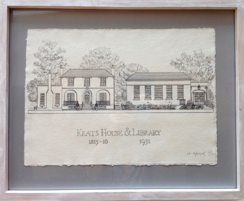


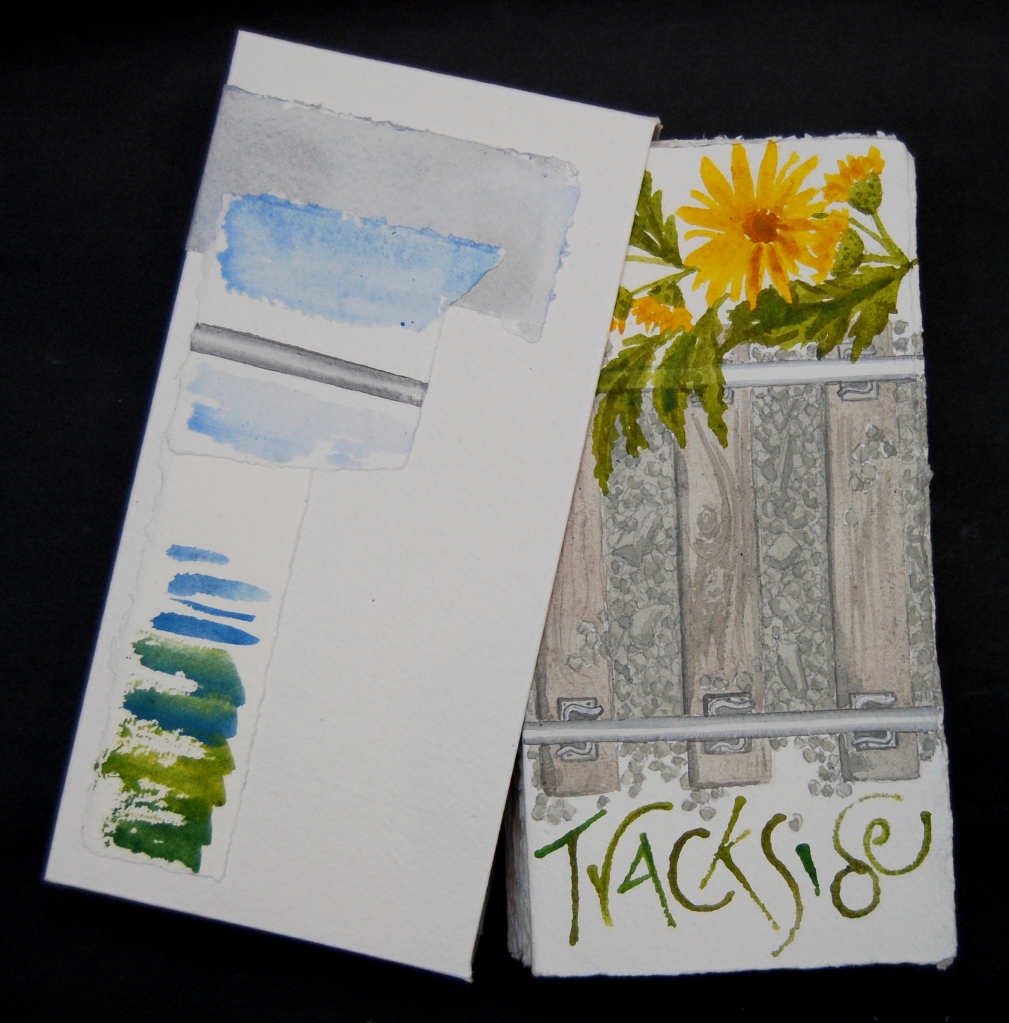


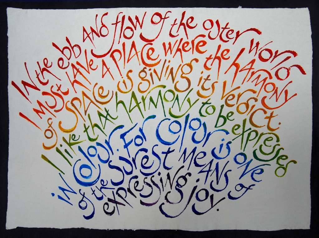


 Wanderer by Maureen Duffy
 London Panopticon by Frances Bingham


 Our second pamphlet is a playtext:
 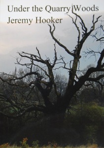 Our third reader was Jeremy Hooker, poet and critic, teacher and broadcaster, whose collection of prose poems
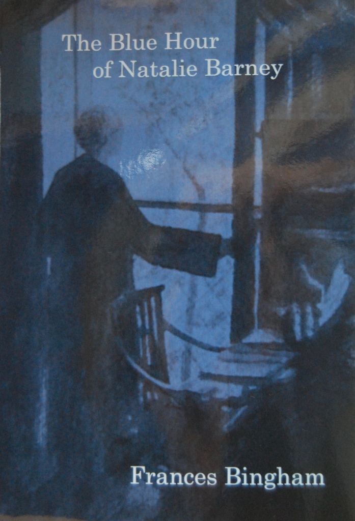

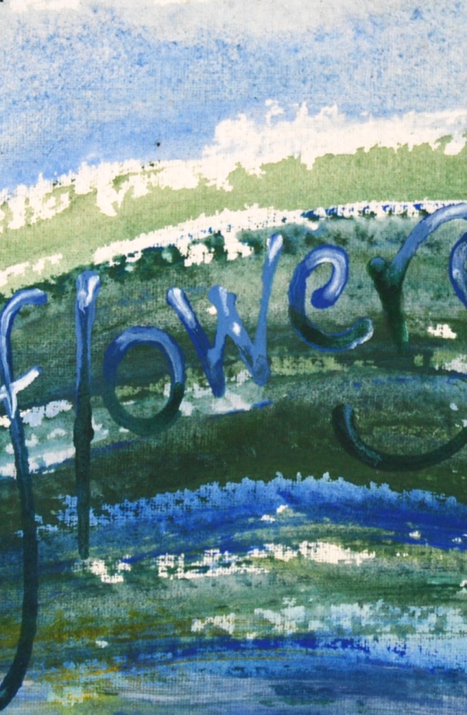


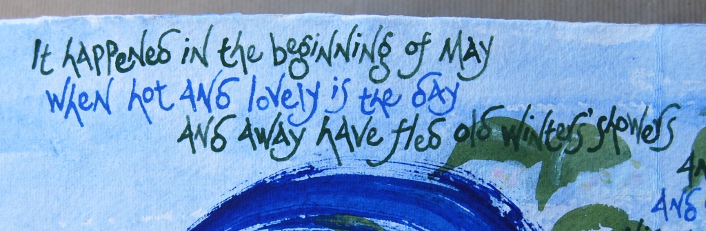

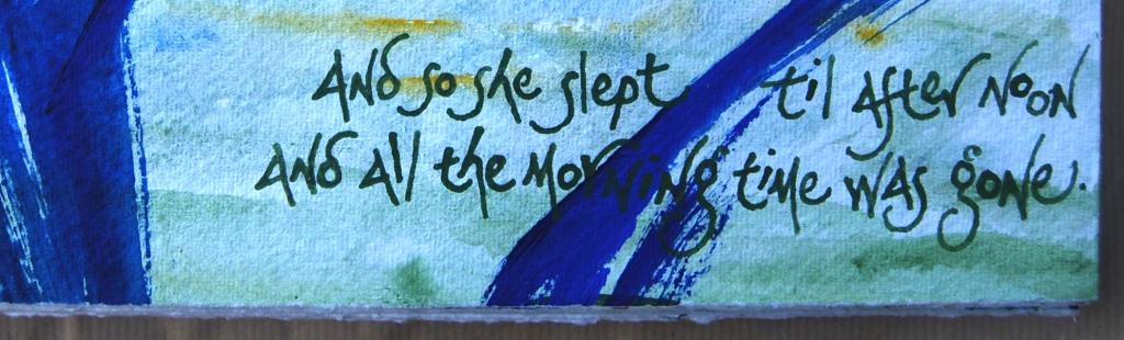
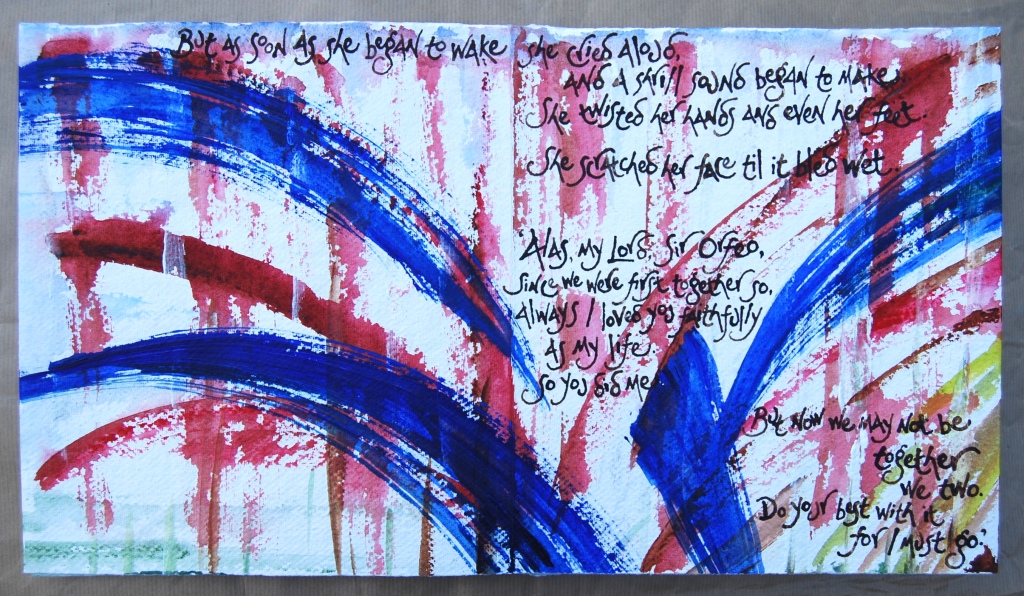


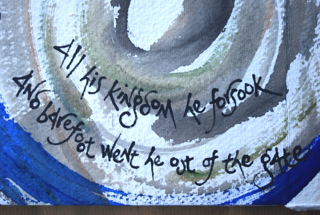


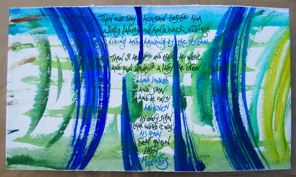


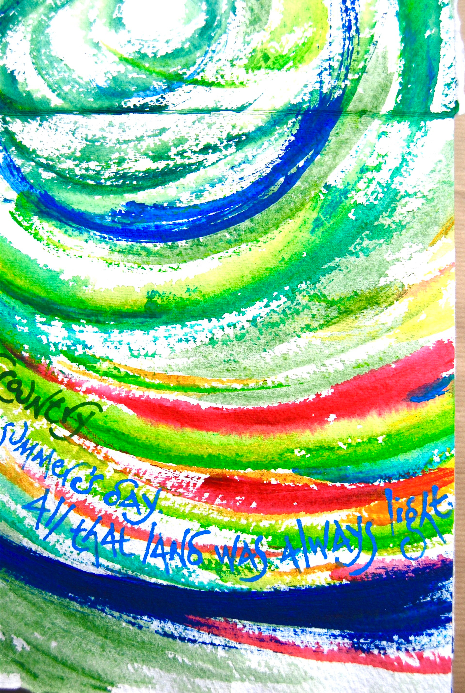


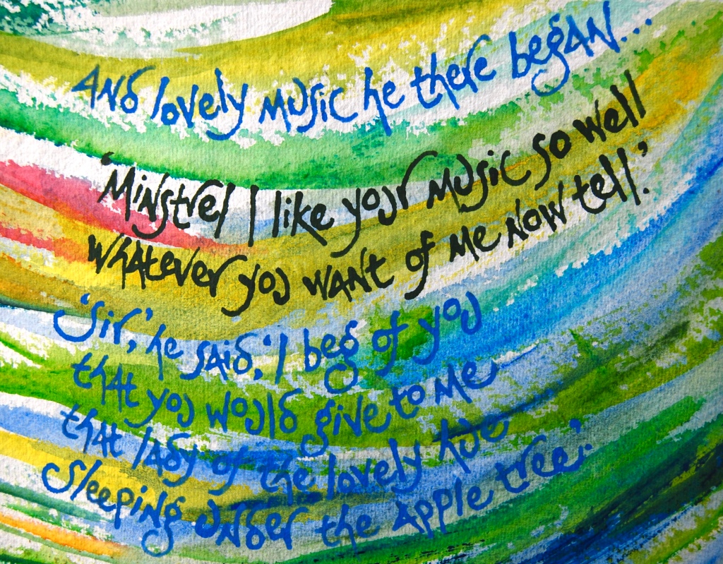


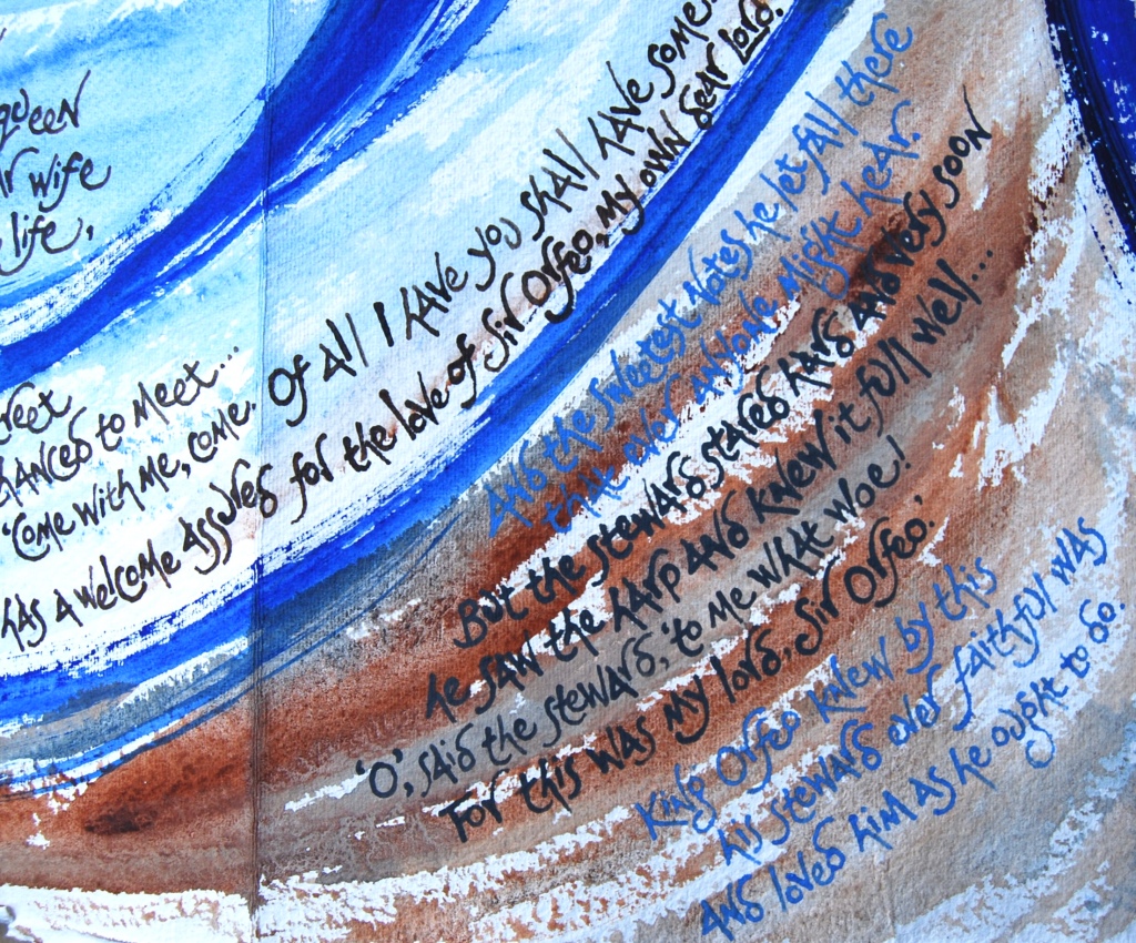


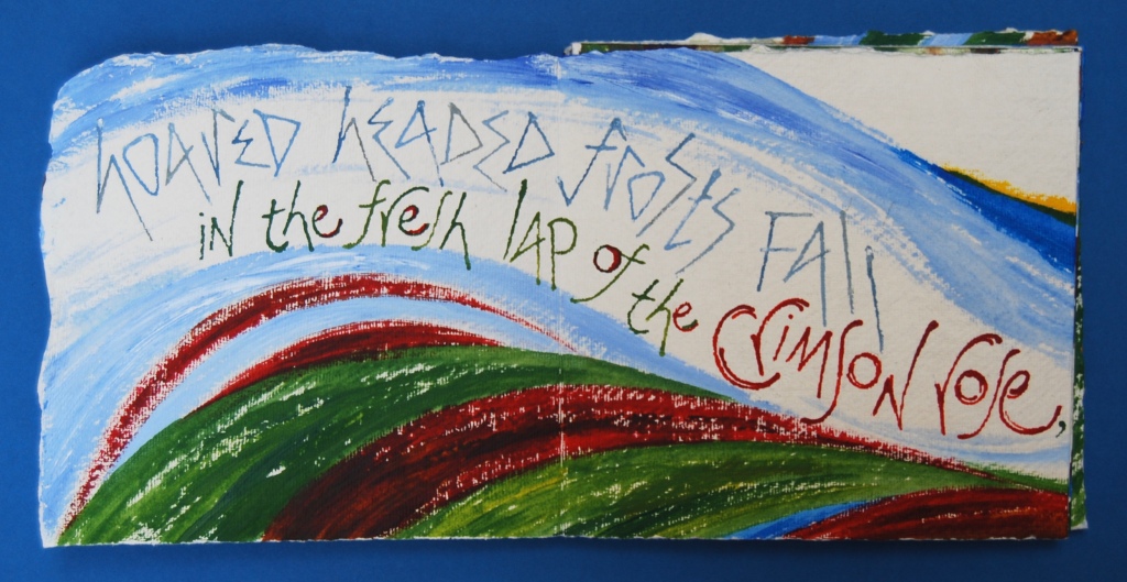


")
")

, text by Frances Bingham")
")
")
")
")
")
")
")
")
")
