Yesterday I was lucky to take a lockdown walk in my own studio, alongside Maureen Duffy, in a live online special event hosted by King’s College London’s Centre for Life-Writing, and sponsored by FUIS (La Federazione Unitaria Italiana Scrittori). We were celebrating Maureen’s work, and also marking the launch of STRANDlines digital collection, which brings together material related to Maureen’s life, work, activism and research, among other exciting features. Here’s a link to a film of the event: A conversation with Maureen Duffy & Liz Mathews.
An event with Maureen’s poetry and conversation will always sound promising, and this one, adeptly chaired by Katie Webb, proved to be very special – even though the members of the great audience were scattered across the globe and in the comfort of their own homes. I feel very privileged to have set many of Maureen’s poems in artist’s books and paperworks (including Paper Wings, my artist’s book setting-to-paper her love-song cycle Songs for Sappho, now on long-term display in the British Library’s Treasures Gallery), and I find her work constantly inspiring. She’s a great collaborator on projects and encourager of artists’ work, and her latest collection of poetry, Wanderer, was published earlier this year by our micro-press, The Pottery Press.
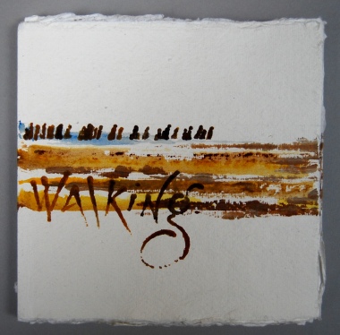
I’ve set five of the poems in that collection (so far), including the poem that gives the collection its title, and I was there to talk about that one (particularly its design and the making process) after Maureen had read the poem. Hearing Maureen read Wanderer is always going to be a moving experience, one that reinforces the empathy and identification at the heart of the poem, and so it proved yesterday evening – a hard act to follow! When I first heard the poem, I was deeply struck by this sense of identification, and I chose to focus my artist’s book on the last eight lines that express so much, aiming to set the lines within a constructed context so that the physical book could embody the words. I called the book Walking.
When I’m working on an artist’s book, I often spend a long time first, looking at the poem and the paper, to see where elements of the book’s structure could reflect aspects of the poem — in terms of meaning and a flow of images — so that the book can embody the words as fully as possible. For this book, I wanted those connections to be a simple as possible, for the book to be sparse, not over-decorated, for every mark to be meaningful.
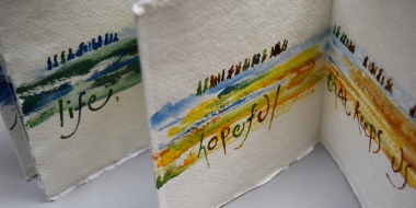
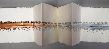
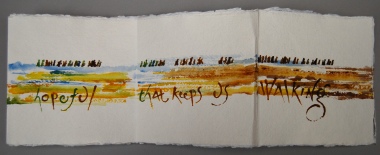
To begin the process, I thought about the first visual image that the poem had given me — that long walk towards safety and freedom — and I conceived the design in terms of three long lines, circling endlessly round a double-sided book, to begin again at the beginning. I saw a long line of wanderers, a long line of watercolour to represent the vast distances of terrain to be crossed, and the words of the poem themselves in a long line — these three lines juxtaposed and mirroring each other along the book’s length.
Then I looked at how the book’s material construction could reflect the meaning of the words, in terms of the size, shape and number of the pages, and the path they follow through the book. This book needed a linear structure, like a classic concertina-fold book, but not exactly. I wanted more continuity than individual jointed pages could give. So I made it from four long sheets of handmade paper like this:
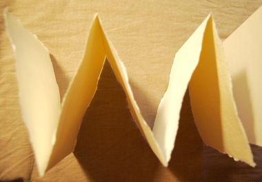
— each sheet folded into a zigzag of five square pages. I constructed it with two sheets side-by side, two sheets back-to-back with the first two, and the middle joint hinged with another short sheet, stuck between the two sides with acid-free adhesive. This made a long book with five double-page spreads on the first side, and four on the other side, plus front and back covers. And in the middle, a visible joint between the sheets. I set the text so that this joint falls at two crucial points in the poem:

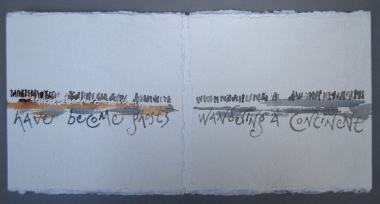
— here on the first side, the valley joint or hinge trough becomes an abyss of nothingness, where the ghostly wanderer, and the line of the terrain they wander, fade into the void —
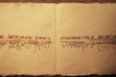
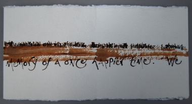
— and the corresponding mountain top joint or hinge peak on the other side becomes the summit, this craggy high pass the wanderer must scale before they can reach the longed-for sunlit lands of life on the other side:


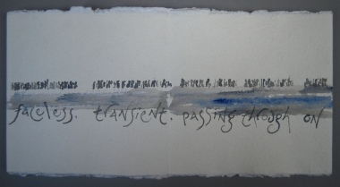
A further way to get the material to reflect the meaning of the words is with colour. The book begins with earthy browns, turning to dry sandy ochre tones of the parched desert,
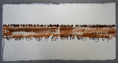
next fades into the faint translucent thin grey, disappearing to nothing at the abyss — and then turns to a watery grey-blue
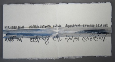
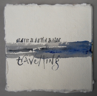
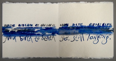
to represent an equally inhospitable sea-crossing — and only on the words ‘longing’ and ‘believing’ do the colours strengthen,
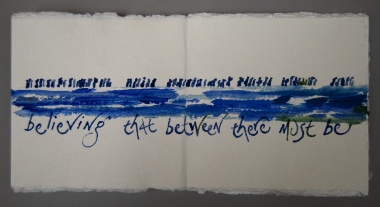
not just in the watercolour line, but in the line of wanderers too, where the figures become more diversely coloured, brighter,
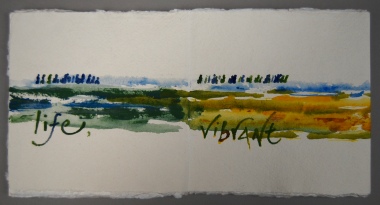
more individually marked, and the line of the words reflects the line of people across the terrain like a mirror, or like a mirage in the desert.

For the lettering, and to make the marks for the people, to reflect the development and movement of the words, I used some quirky lettering tools:
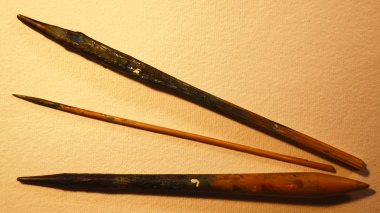
a driftwood stick from the Thames, carved by water and flung up on the sandy foreshore on London’s South Bank; a wooden kebab-stick sharpened to a point; and a pottery tool. These all make great lettering-pens because they’re so rudimentary — the lack of a nib-dip to control the flow of ink or paint means that the colour has its own fluid agency; I don’t like to be too controlling of the materials — I like to let them do their own thing (up to a point) and work with the freedom of the result. The same thing applies to the tool I used to mark the people-line:


— a wooden clothes-peg, with its wire stripped out, makes two beautiful pens which you can use in different ways — either like a broad italic nib, or:
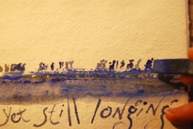
— sideways on, or even using just the corner for a smaller mark, to delineate extra details. You can see in this photo the way that the paint has flowed on to the paper quite thickly for the figure just to the left of the peg-pen, making it look very heavily burdened, or perhaps as though carrying a child; but the figure walking behind that one, marked when there was hardly any paint left on the peg, appears very faintly, almost disappearing. This technique adds so much to the individuality of each figure, making each one unique, unrepeatable.
A clothes-peg is a nice domestic reference, intimate but universal, bringing individuality to each person in the line — each one carrying their own burden, their own history, their own life. I wanted this to reflect the poem’s identification with the wanderer, not just an anonymous migrant, refugee, homeless person, but a unique, unrepeatable individual human being — each one of us, indeed.
I’d like to show you the book, setting the last octet from Wanderer, page-by-page now; you’ll need to imagine it with the pages running forward side-by-side, flowing on from each other, rather than vertically stacked as on this page:
— And I’ll be adding a link to the recording of the event here as soon as it’s available. Here now!
Maureen Duffy’s collection Wanderer is available from us here at The Pottery Press, (£9.99) or to order from bookshops including the Owl Bookshop in London’s Kentish Town, who have an order and collection service available throughout lockdown, and welcome orders by email or phone:
owlbookshop@gmail.com
Owl Bookshop, 207-207 Kentish Town Road London NW5 2JU
Tel: 020 7485 7793

Leave a comment